afc richmond
Drawing inspiration from a popular Apple TV series, I embarked on a transformative rebranding project for AFC Richmond, an imaginary team in the English Premier League, with the objective of revamping their brand identity by redesigning their logo and showcasing its application in various contexts. By infusing the reimagined brand identity with a contemporary aesthetic and a touch of timeless elegance, I aimed to position AFC Richmond as a beacon of innovation and tradition, captivating both existing and new fans with its refreshed visual narrative.
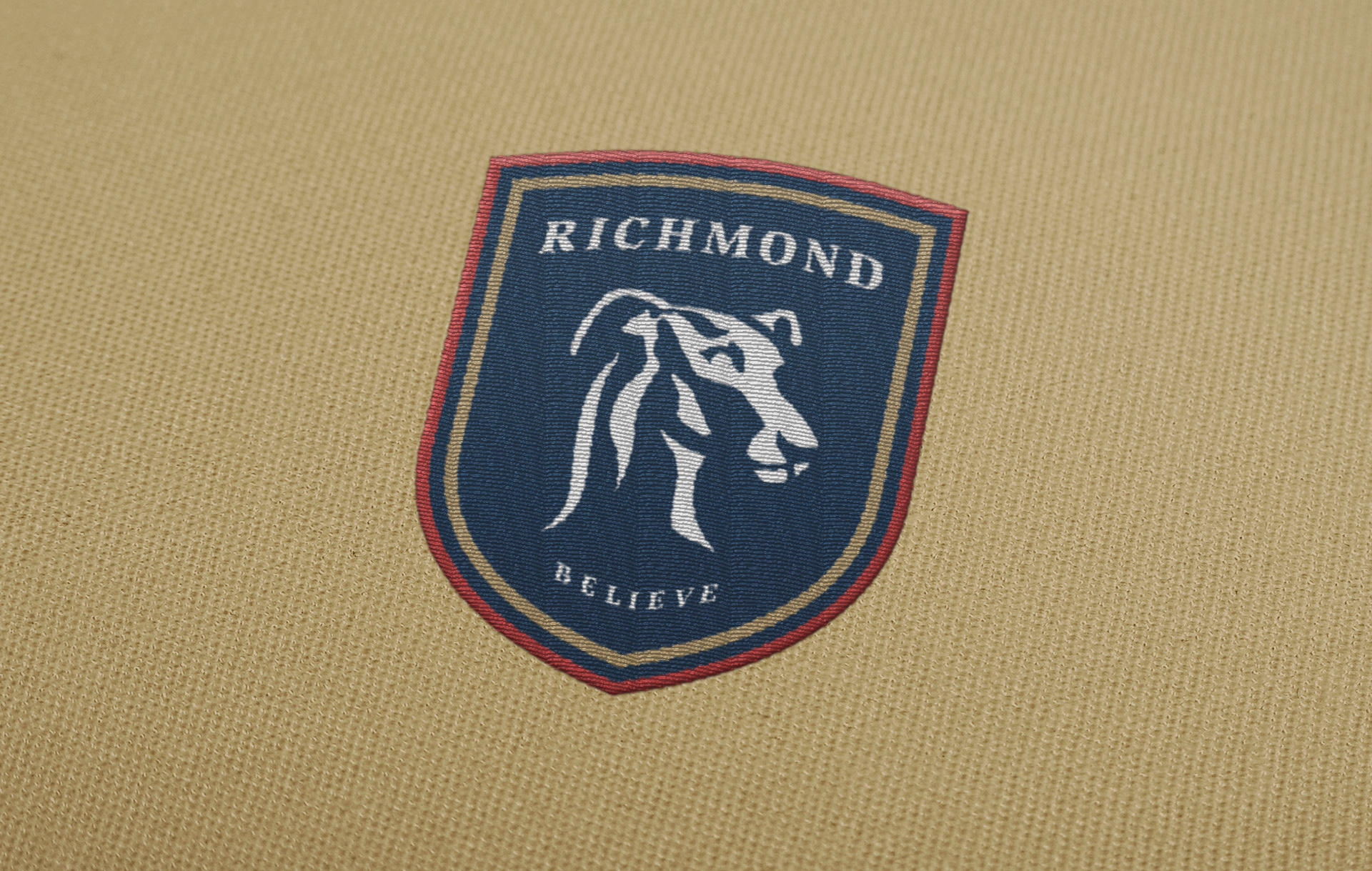
PRIMARY BRANDMARK
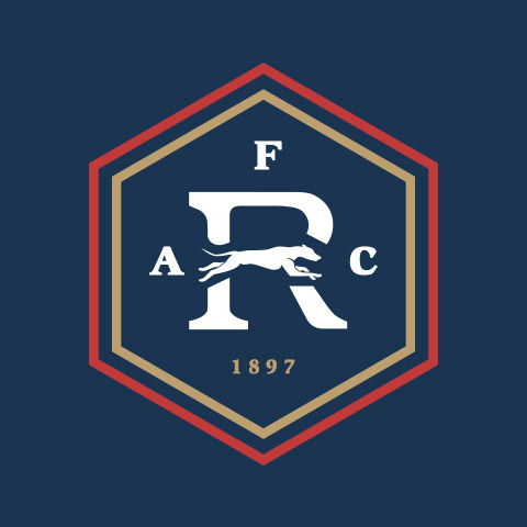
The updated primary brandmark of AFC Richmond focuses on condensing the previous design to its core elements that symbolize the essence of the club. Prominently featured at the forefront is the charming depiction of a Greyhound, symbolizing athleticism and grace. The AFC acronym has been replaced with a serif logotype, paying homage to the club's rich history. Positioned at the bottom is the club's vital call to action, encapsulating its spirit in a single word: "believe."


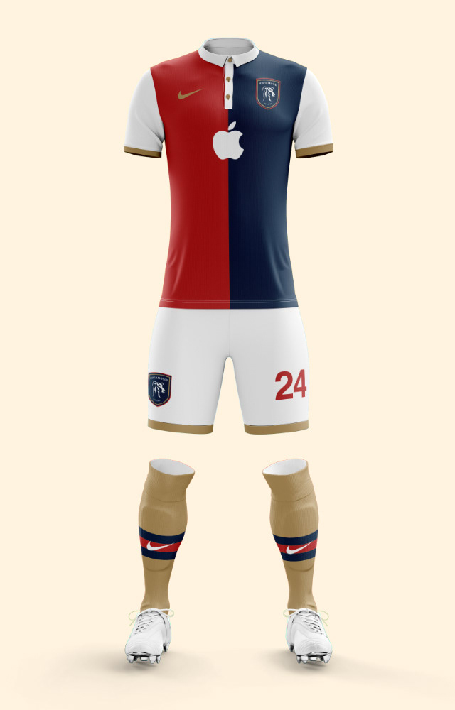
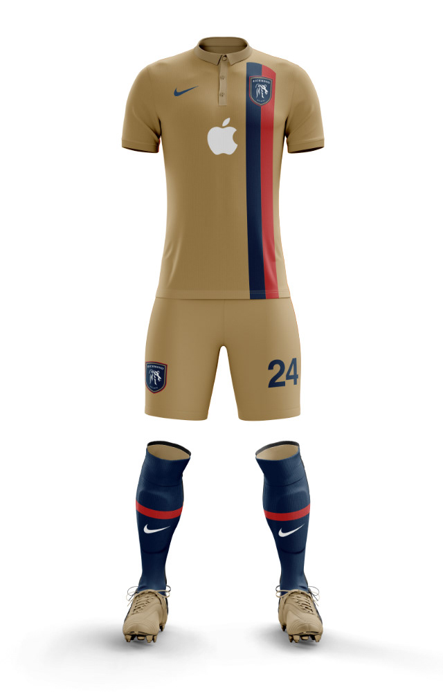
jerseys
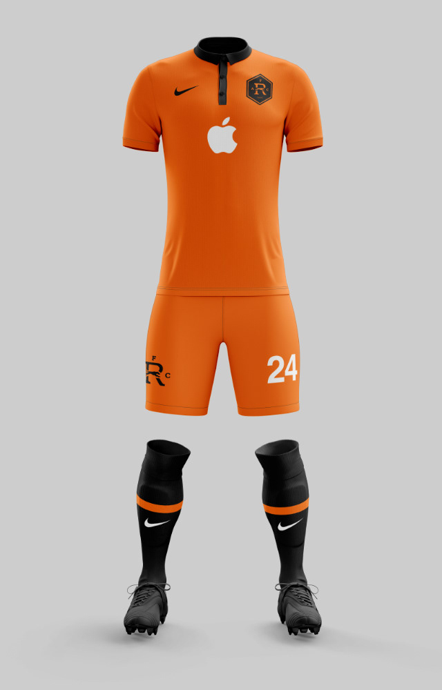
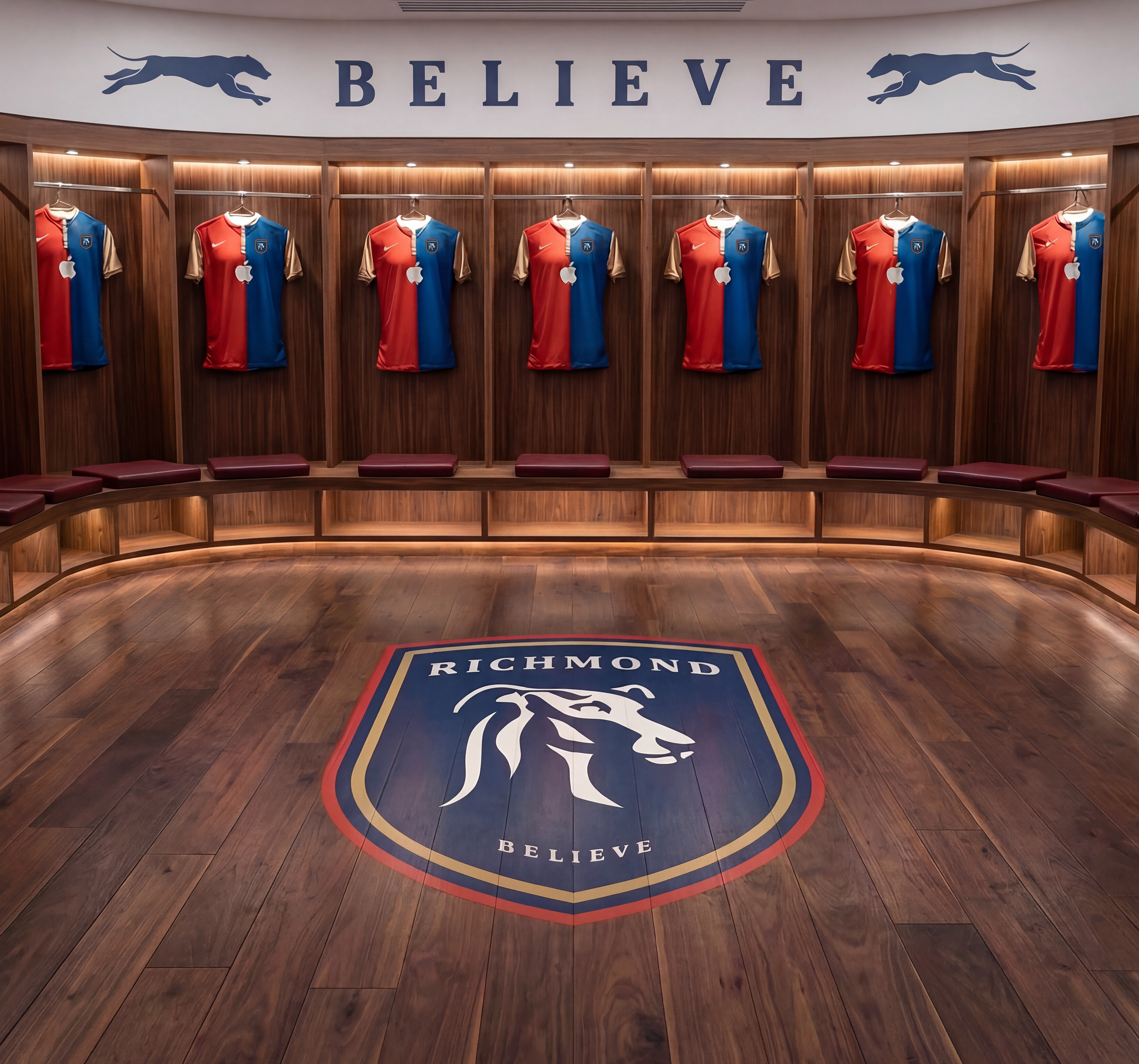
I developed fresh jersey designs that paid homage to the original jerseys from the TV show while breathing new life into them through the revamped branding. Recognizing the natural alignment between the team and Apple, it seemed only fitting to make Apple their primary jersey sponsor, forging a unique partnership that seamlessly merged the realms of technology and football.
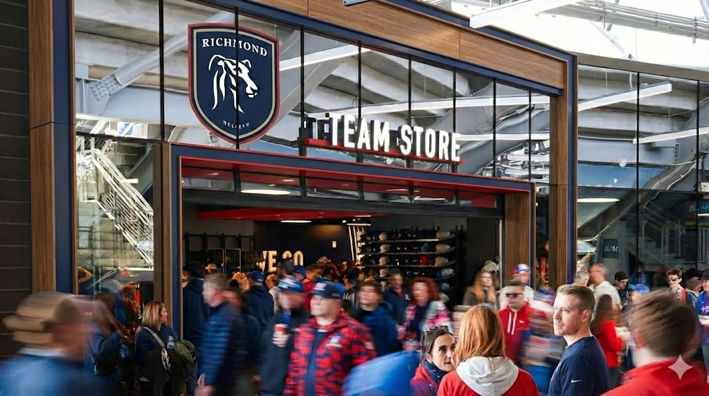
STADIUM ACTIVATION

APPAREL DESIGN
In an endeavor to reflect the essence of the new brand identity, a set of innovative shirt designs was meticulously crafted. These designs not only featured the primary brand but also skillfully incorporated elements from the extended logo system, creating a cohesive and visually captivating representation of AFC Richmond's renewed direction.

