Event Branding + Campaign Concept
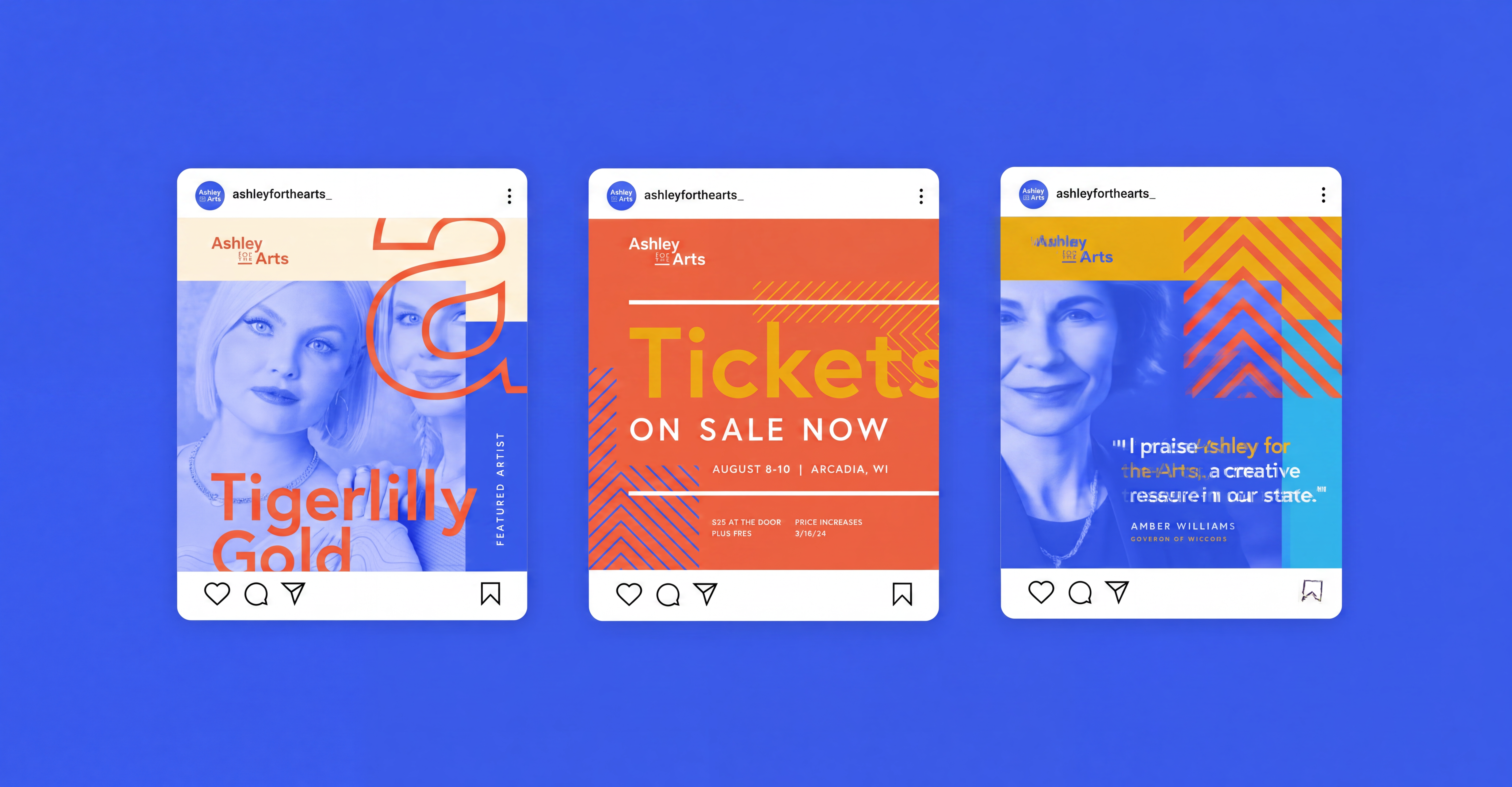
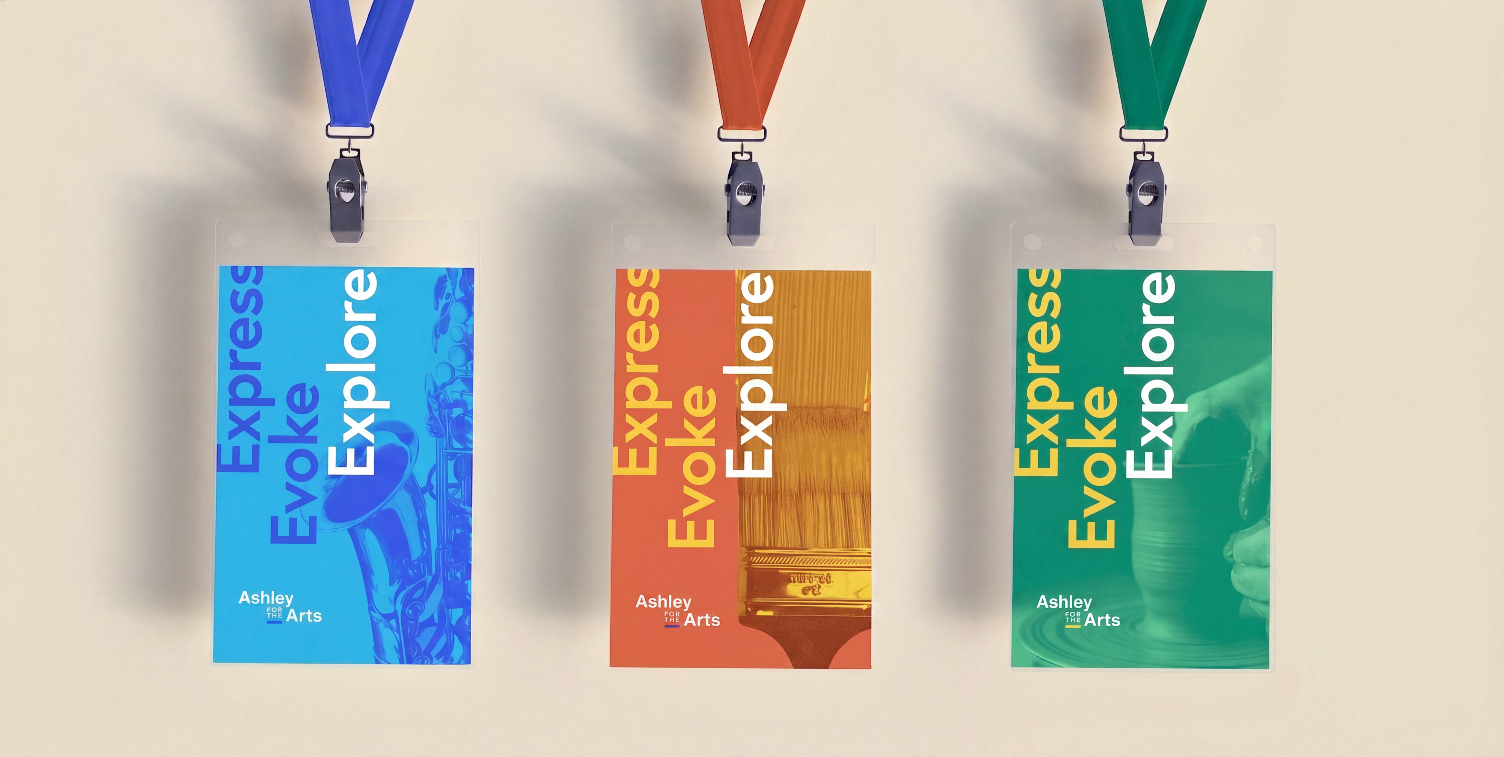
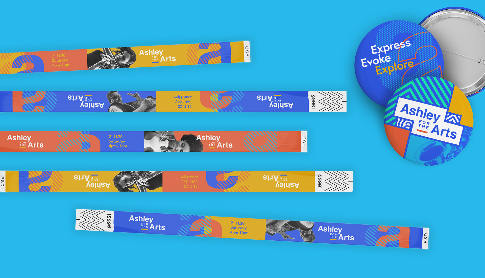
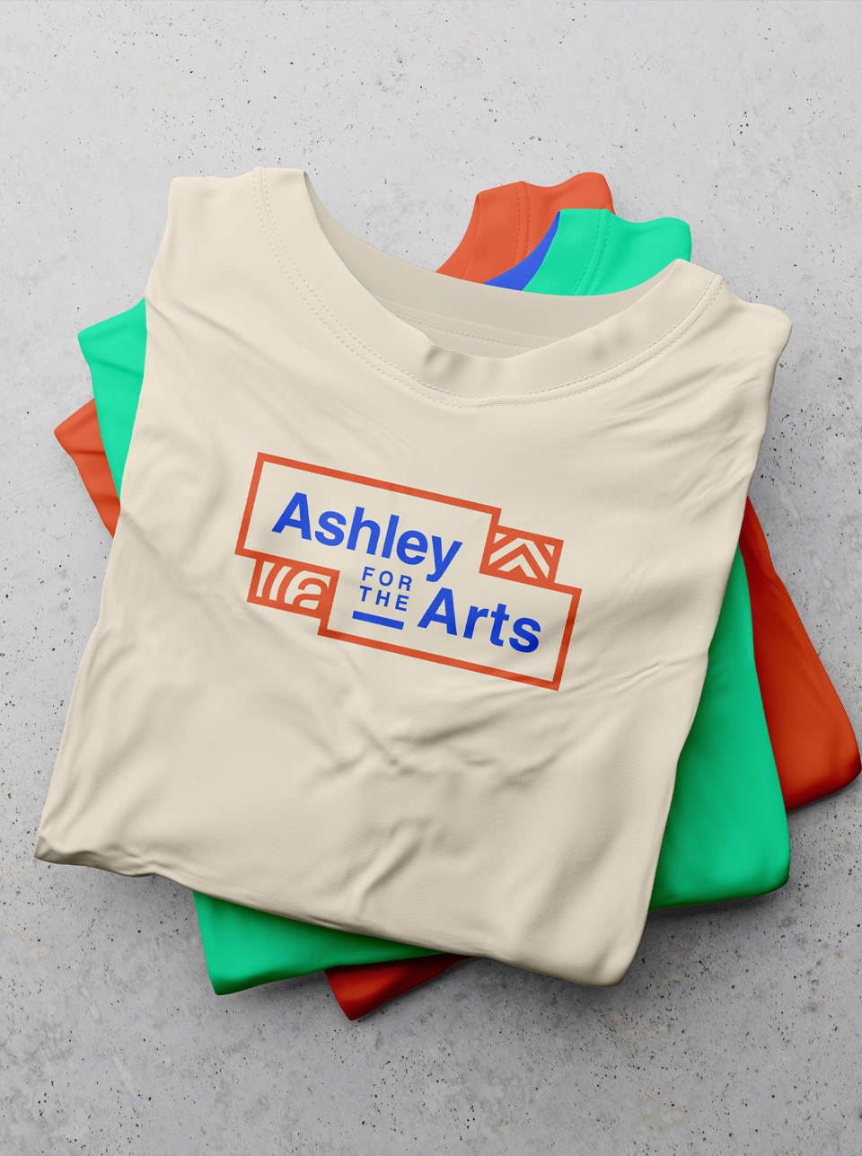
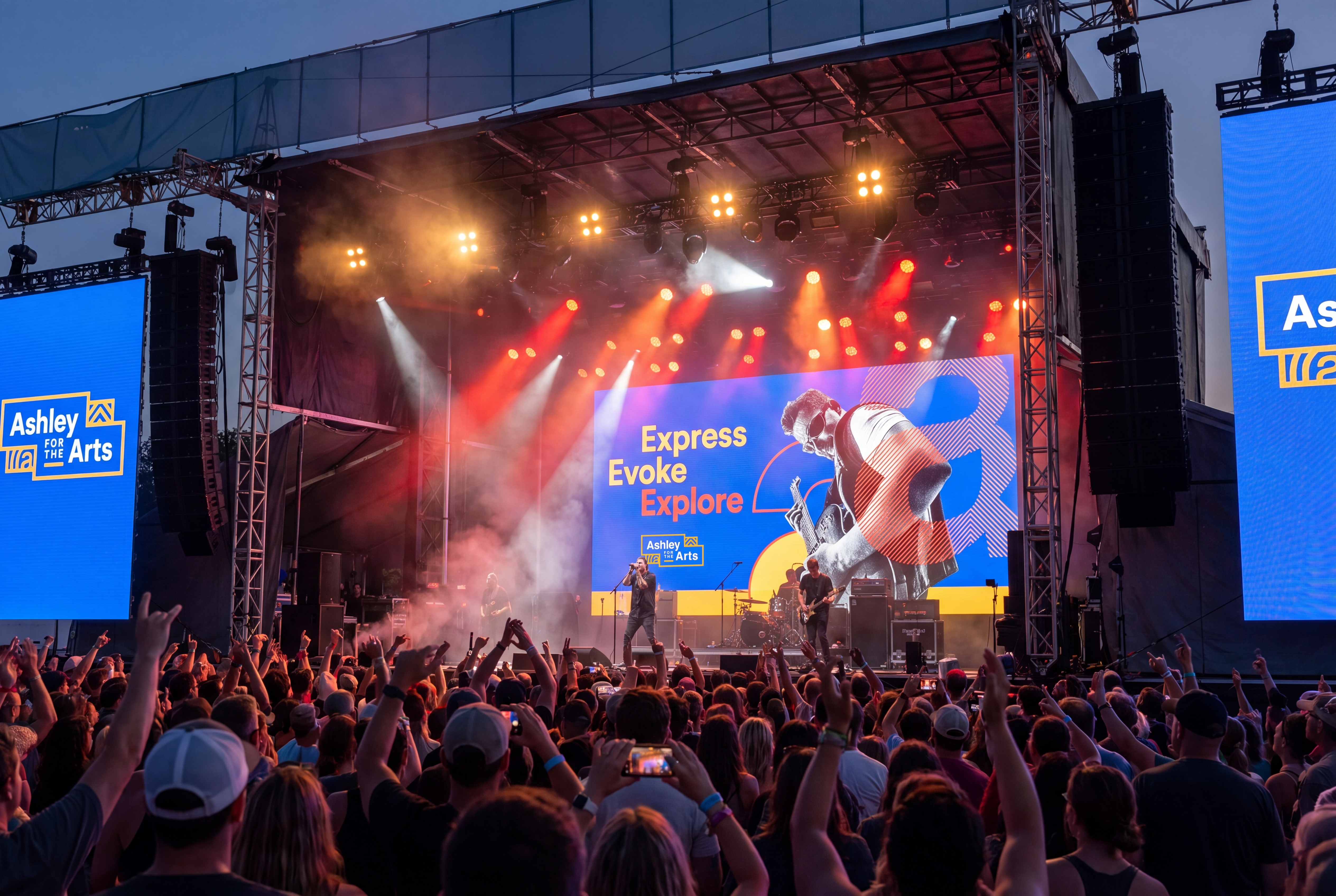
Ashley for the Arts needed a campaign identity that could capture the energy, creativity, and community spirit of a large-scale arts festival while still feeling connected to Ashley's broader brand presence.
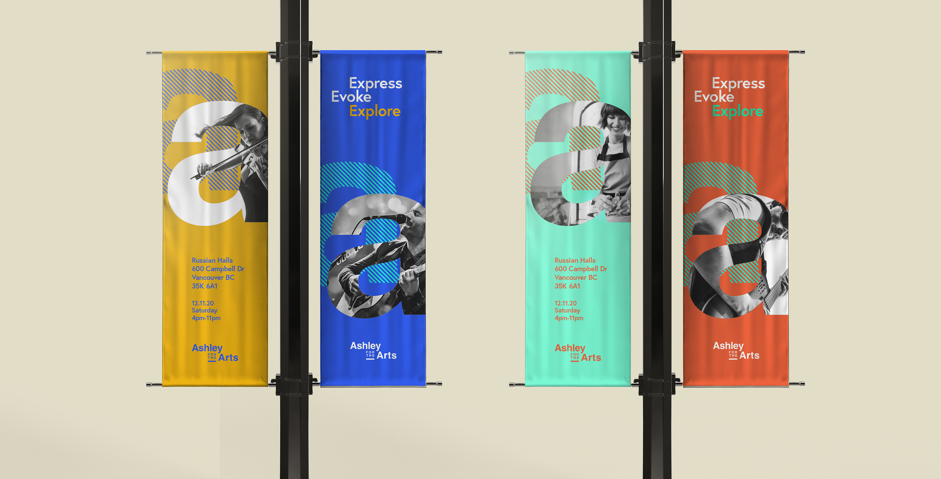
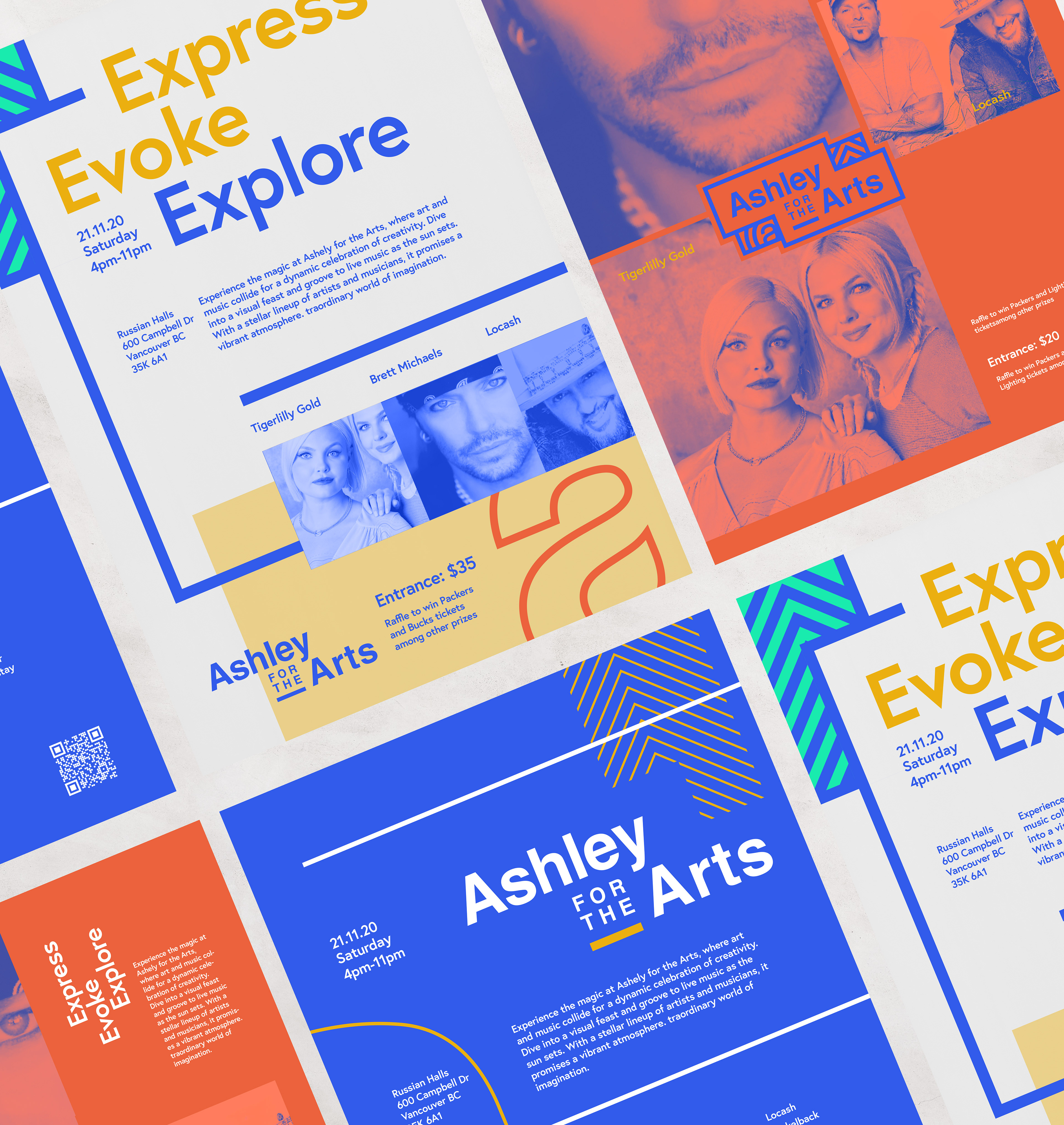
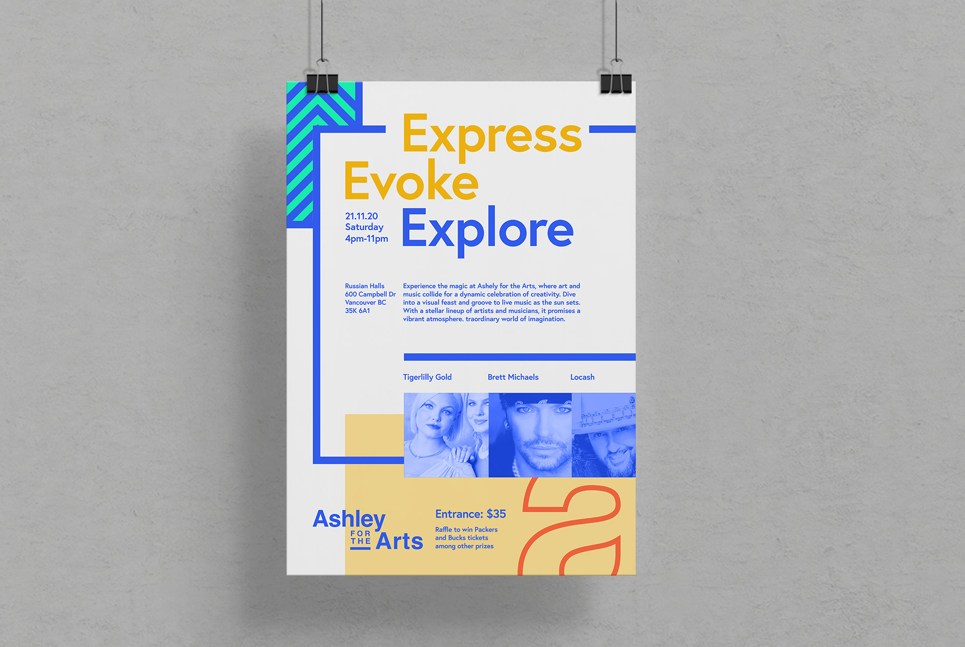
The proposed visual direction used bold color, expressive layouts, and energetic graphic elements to reflect the vibrancy of the festival experience. The system was designed to feel lively and approachable across promotional materials, event graphics, and attendee-facing touchpoints.
01 / Festival Identity
The identity concept was developed to give Ashley for the Arts a more vibrant and memorable visual presence. The direction leaned into the expressive nature of the event, creating a system that felt energetic, accessible, and community-focused.
02 / Color + Energy
A bold and vivid color palette helped communicate the excitement of the festival while giving the campaign a distinct personality. The visual language was designed to feel lively without becoming chaotic, balancing expressive color with clear hierarchy and structure.


03 / Event Applications
The branding system was intended to extend across a variety of event and promotional touchpoints, from digital marketing and social graphics to printed materials, signage, and attendee-facing communications.


04 / Brand Experience
The final proposal created a flexible campaign direction that could help unify the festival experience and make Ashley for the Arts feel more ownable, recognizable, and visually engaging.